2024 Oscars Prediction Market Comparison
Manifold, Kalshi, Polymarket, and DraftKings
Introduction
The goal of this post is to report performance metrics for the Oscars 2024 predictions from a couple different prediction market platforms. Importantly, this is a fair apples-to-apples comparison between the platforms, considering only questions for which all of them gave a prediction, and with predictions recorded at the same time (give or take a couple minutes).
The sites included in this analysis are: Manifold, Kalshi, Polymarket, and DraftKings (a traditional sports betting company).
Brief note on data collection:
Probabilities were recorded on Friday night March 8, 2024 (2 days before the Oscars). Video documentation here.
Odds from DraftKings were collected via SportsBookReview, which at the time of collection had most recently been updated on March 7. So the DraftKings predictions are possibly at a slight disadvantage compared to the others, since they’re a day older.
DraftKings odds were only recorded for markets where at least one of the other sites gave a prediction.
Brier Scores
Very Short Explanation of Brier Scores:
In this formula, N is the total number of predictions, f_i is the prediction probability, and o_i is the true outcome of the event (either 1 if it happened or 0 if it didn’t). (Sorry about the awkward notation, I haven’t really been able to find a good way to write math notation like subscripts and stuff on Substack.)
Basically, this is just a measure of the forecast’s average squared deviation from the true outcomes of the events being predicted. The lower the Brier score, the better the forecast, and a perfect score is 0.
Overlap of All Four
First we consider the questions for which all four platforms gave a prediction. This overlap gives us 24 events across 11 different awards. The Brier scores for this comparison are shown in the table below.
Overlap of Manifold, Kalshi, and DraftKings
Taking the overlap of all four is quite limiting, and we can get a larger sample of questions by taking the overlap of only 3. The table below shows a comparison using the overlap of Manifold, Kalshi, and DraftKings, which gives us 35 events across 14 different awards.
Overlap of Manifold, Polymarket, and DraftKings
The table below shows the comparison between Manifold, Polymarket, and DraftKings. This overlap gives us 32 events across 11 different awards.
Calibration Plots
Very Short Explanation of Calibration Plots: Let’s say that I predict a 40% chance of rain tomorrow, and then it ends up raining. Does that mean that I got it wrong? Well, no… 40% isn’t zero. Things that have 40% probability happen sometimes. But I didn’t get it right either. For a single probabilistic forecast, you can never really say if it was right or wrong, unless you forecast something with 0% or 100% chance.
But with a large collection of predictions, we can say if someone is well-calibrated or not. Being well-calibrated means that things I forecast with about 40% chance tend to happen about 40% of the time, things I forecast with about 80% chance tend to happen about 80% of the time, and so on.
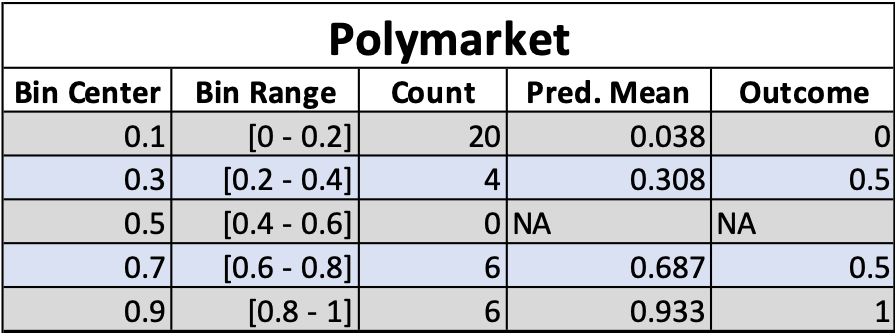
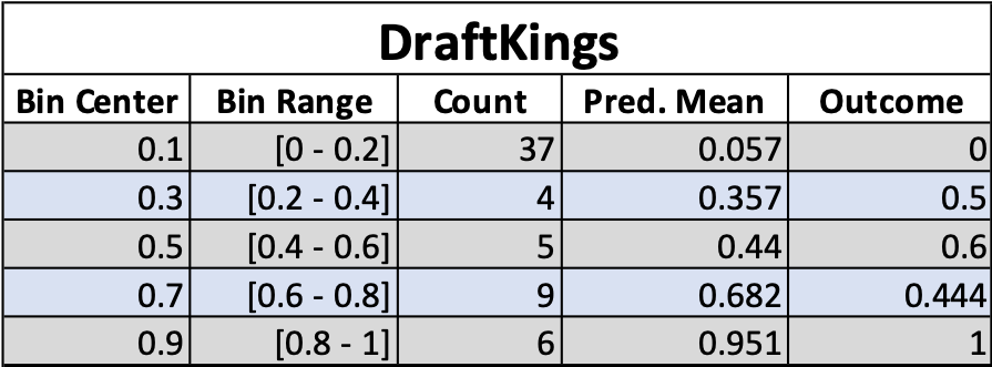
Calibration plots allow us to visualize this. The horizontal axis shows binned prediction probabilities for events, and the vertical axis shows the fraction of those events that ended up happening. In the plots below, I’ve also scaled the size of the points to reflect how many events fell into each bin.
The calibration plots below show the results for each platform separately, considering all questions for which that platform gave a prediction, without considering overlap between platforms. So they should not be used for cross-platform comparison.
“Mike this is a boring result, why the heck are you even making this post?”
I agree, this result was pretty boring! There wasn’t any huge difference in platform performance, and all the platforms did about as well as each other. This isn’t surprising, because if you look at the prediction probabilities (available on my GitHub), all four platforms mostly gave very similar predictions. Maybe this is still an interesting result though, since Manifold (which uses play-money) did almost as well as the real money platforms. Besides that, pretty boring results though.
But I’m committed to publishing boring results on this blog, because when people only publish exciting results that creates a bias and skews the distribution of reported results. This is called the “filedrawer effect,” and is one of the causes behind the ongoing replication crisis in academia.
Lately I’ve been thinking that one of the most important things in science is just the non-glamorous collection and reporting of data, with the goal of contributing to a large, accurate distribution that you can use to say something about the thing you’re studying. This is one of the goals of this blog — to simply collect forecast data, evaluate it for accuracy, and report the results, with the goal of producing correct information about forecasting and prediction market performance, whether that information is exciting or not.
Thanks for reading!
Further Reading
Scott Alexander’s Prediction Market FAQ
Superforecasting: The Art and Science of Prediction by Phillip Tetlock and Dan Gardner
The Signal and the Noise by Nate Silver
Idea Futures by Robin Hanson
Thinking in Bets by Annie Duke


Your explanation for why you published this is great. We need to spread the attitude. Unexciting research is still useful research.