Scoring 2024 Election Forecasts
How accurate were prediction markets?
(Sorry it took so long to publish this, but I was waiting for the CA-13 House race, which just got called yesterday)
Introduction
The goal of this post is to report evaluation metrics for some forecasts of the 2024 US election, similar to the forecast evaluation I did for the 2022 midterms. Importantly, this is an apples-to-apples comparison, judging forecasts on the same set of 50 questions (including presidential winner and individual state results, House/Senate control, specific House/Senate races, and specific governor races) with forecast data recorded at the same time. This was the list of questions.
The forecasts are from:
Manifold Markets — a play-money prediction market site. Lately they’ve also had some real-money markets, but I only collected data from the play-money ones, since I’m interested in studying whether the play-money reputation-based incentive leads to a similar level of accuracy as real-money prediction markets.
Polymarket — a real-money prediction market site.
Crowdsourced forecast — generated largely by you guys, as part of the forecasting contest (winners announced later in this post btw).
My own forecast — which turned out to be completely wrong and terrible.
Nate Silver’s forecast — NOTE: Nate Silver only gave a forecast of the presidential race, not the House, Senate, and governor races, so his forecast will be judged in a separate results section, considering only questions relating to the presidential race. ANOTHER NOTE: I collected the Nate Silver forecasts at the same time as the Polymarket and Manifold forecasts (around 8am). This meant that each day that I collected, I was actually recording Nate Silver’s forecast from the previous day, since he updates them later in the day. So if you’re looking at the code and see his forecasts labeled one day earlier, that’s why.
For Manifold, Polymarket, and Nate Silver, I collected data at 3 timepoints: 2 weeks before the election, 1 week before, and 1 day before. The crowdsourced forecast and my own forecast were only 1 day before.
The results reported here are Brier scores (remember — lower is better!). If you don’t know what a Brier score is, there’s an explanation in the Methodology section at the end. I’ve also included calibration plots, although I think the sample size is too small for them to really be meaningful.
The forecast data, as well as the code I used in the analysis, are available on my Github. Let me know if you have any questions!
Results 1: Full Set of 50 Questions
The results are pretty messy here and it’s tough to really tell a story about them — but that’s science! The goal of this project was just to collect and report data, not to try to tell any particular story.
One thing that’s somewhat notable though is that for Polymarket, the forecasts were notably worse the day before the election, compared to 1-2 weeks before. For a reminder of what the markets looked like, here’s their market on whether Trump would win or not:
1-2 weeks out, Trump was at >60% chance of winning (and generally the Polymarket forecasts were more optimistic for the Republicans, across many races). But then in the days just before the election, things swung back closer to 50/50. By contrast, the play-money markets on Manifold were more stable throughout this period.
Are Manifold play-money prices more stable than Polymarket prices in general? It’s hard to say based on such a small sample size, so I’d caution against drawing any strong conclusions like that. But I’m going to continue doing analyses like this in the future, so I’ll be interesting to see if that pattern keeps coming up.
Another result — you guys (the crowdsourced average forecast) did pretty bad, but I did even worse! I guess I won’t quit my day job, lol.
Results 2: Subset of Nate Silver Questions
The previous results were for all 50 questions (president, congress, governors). But Nate Silver only gave a forecast for the presidential race, so the results in this section are for a subset of 20 questions for which there was an overlap between Nate Silver’s forecast and the others.
Again, tough to draw any solid conclusions here, especially because of the tiny sample size. But Nate Silver’s forecast wasn’t terrible, like a lot of internet-haters have suggested. He did about as well as Manifold, and only slightly worse than Polymarket (which everyone has been congratulating for being especially accurate).
Anyway, sorry that the results are kinda boring this election cycle. But I’m committed to publishing boring results on this blog, because when people only publish exciting results that creates a bias and skews the distribution of reported results. This is called the “filedrawer effect,” and is one of the causes behind the ongoing replication crisis in academia. Lately I’ve been thinking that one of the most important things in science is just the non-glamorous collection and reporting of data, with the goal of contributing to a large, accurate distribution that you can use to say something about the thing you’re studying. So one of the goals of this blog is basically to do that for prediction market accuracy.
Contest Winners!
Here are the results of the election forecast contest. Details on the scoring methodology here (basically time-weighted Brier, with a slight reward for submitting early). Congrats to the winners, especially Jonny, who won both First Prize and the early submission prize. Also, for those interested, the third-place winner Frederik Holzer published his forecast on this website.
Thank you to everyone who participated!
Calibration Plots
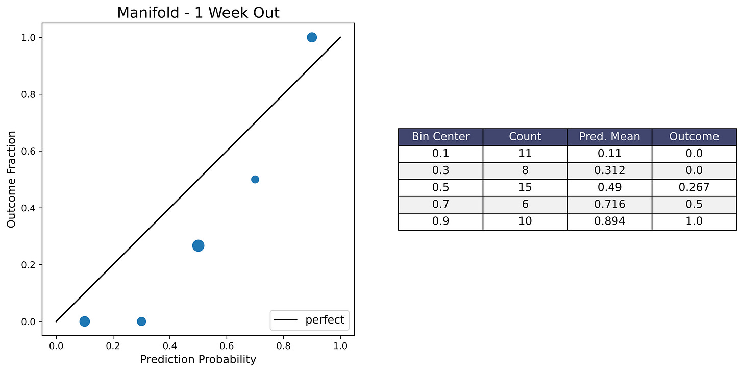
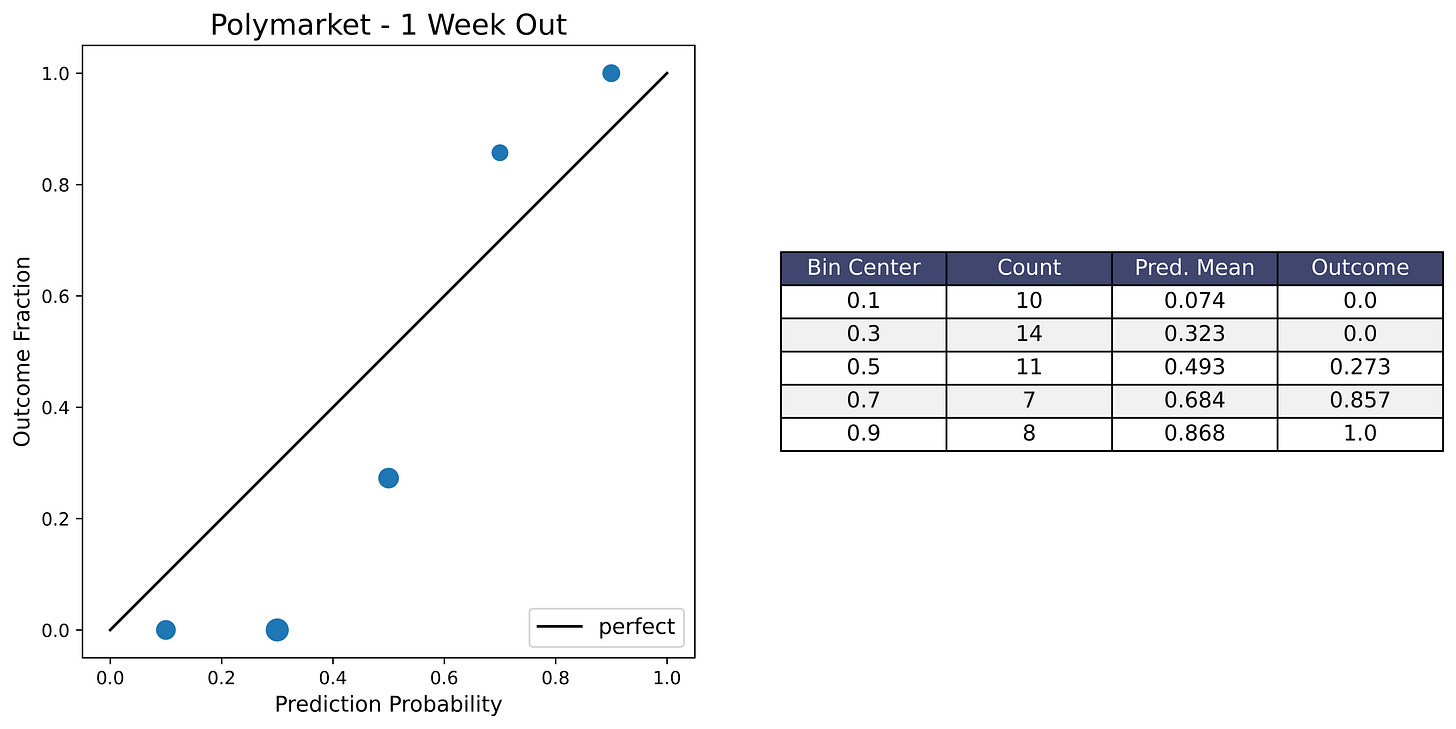
I’m including calibration plots here in case people want to see them. If you don’t know what a calibration plot is, please see the Methodology section at the very end for an explanation. Anyway, I don’t think they’re very informative because the sample size is just too small — only 50 questions, and only 20 for the Nate Silver subset. So the plots ended up looking pretty bad from a visual standpoint, even though the forecast Brier scores were mostly decent.
Another thing to note is that many of the elections that were forecasts with around 0.5 probability (like the swing states) ended up swinging in the same direction this cycle (toward the Republicans), so that’s why many of the plots have a dip in the middle.
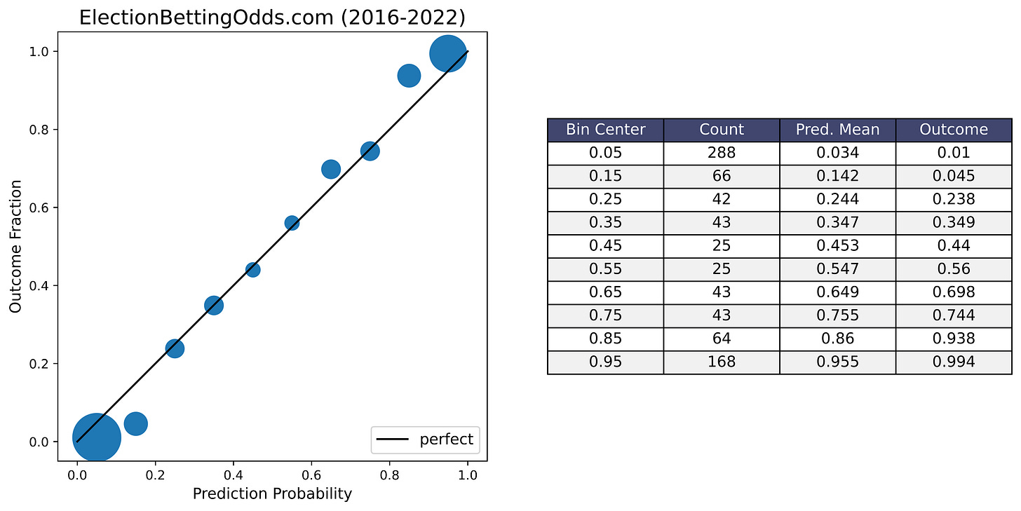
For comparison I’ve also included an example of a calibration plot for election market odds from ElectionBettingOdds.com in the conclusion section, with 807 events going all the way back to 2016. With that, you can get an idea of how well election markets are calibrated when the sample size is large enough and when there are many election cycles with some swinging towards the Republicans and some towards the Democrats.
Conclusion
Like I’ve been saying, I would caution against drawing any strong conclusions from the results in this post. My goal with this project (and all of these prediction market analysis projects) was to collect and report data, not to attempt to tell any particular story. So I would be cautious about extrapolating.
And this is a bit tough to say, because I’ve been a huge fan of prediction markets ever since the old PredictIt days, so it’s tempting to go along with the media in congratulating them and declaring victory for Polymarket. But I’m still not sure if what we saw from Polymarket was real insight, or just a bias toward the Republicans, combined with the election happening to tilt to the Republicans (see also Scott Alexander’s recent post on this). So we’ll have to wait and see if they’re able to keep up this level of accuracy in the future, including with election cycles that happen to tilt in favor of the Democrats. It could also be that they are biased in favor of the Republicans, but each cycle more and more people notice this and exploit it by taking the other side of these bets, and the bias gets a little smaller each time.
Anyway, with all that being said, I think the long-run performance of election markets overall has been pretty good. I mentioned before that the calibration plots for this project look pretty bad because of the small sample size, but as a point of comparison here’s a calibration plot of the ElectionBettingOdds.com track record, with 807 events going all the way back to 2016.
Not bad! Events predicted to happen with 0.25 probability happened about 25% of the time, 0.75 probability happen about 75% of the time, and so on. I’ve also written before about sports betting markets, which have similarly impressive calibration, as a proof of concept for the ability of betting markets to make accurate probabilistic forecasts. So yeah, I’m pretty bullish on prediction markets, even though I’m hesitant to draw too strong of a conclusion from this election cycle alone.
Anyway thanks for reading, and I’ll see you guys in 2026 for the midterms.
Further Reading
Superforecasting: The Art and Science of Prediction by Phillip Tetlock and Dan Gardner. AMAZING BOOK!! Really the best introduction to forecasting.
The Signal and the Noise by Nate Silver
“A Bet Is a Tax on Bullshit” – Marginal Revolution post by Alex Tabarrok
Idea Futures by Robin Hanson
Introduction to Prediction Markets, by Jorge I. Velez
Scott Alexander’s Prediction Market FAQ
Methodology
(copied from my 2022 forecast evaluation)
I kinda feel weird trying to explain something when someone else has already done a better job of explaining it than me – I’d rather just refer people to the best possible explanation of the thing. In this case, this lecture from Phillip Tetlock does a better job of explaining the problem formulation, calibration plots, and Brier scores than I can – he also has a great book on the topic.
With that being said, I’ll still provide some explanations here in case you don’t feel like watching a lecture or reading an entire book.
Data Format: Probabilities and Outcomes
In forecasting, the prediction of an event happening or not happening is usually given in the form of a probability. For prediction markets, these are typically prices (like cents on the dollar) that can also be viewed as probabilities ($0.20 corresponds to a probability of 0.2). The outcomes can be labeled with 1 and 0 depending on whether the event happens or not.
So, whether we’re talking about sports, elections, current events, or something else, most forecast or prediction market datasets with binary yes/no outcomes can be represented in this format:
The data spreadsheet includes other information, like the actual question being forecast, but in order to calculate the evaluation metrics all you really need is the forecast probability and 0/1 outcome.
Brier Score
The most commonly used metric for scoring probabilistic forecasts is the Brier score. Here is the formula:
Here, N is the total number of predictions, f_i is the prediction probability, and o_i is the true outcome of the event (either 1 or 0). (Sorry about the awkward notation, I haven’t really been able to find a good way to write math notation like subscripts and stuff on Substack.)
Basically, this is just a measure of the forecast’s average squared deviation from the true outcomes of the events being predicted. The lower the Brier score, the better the forecast, and a perfect score is 0.
Calibration Plots
A common objection people first have to probabilistic forecasts is that it seems impossible to say if they’re correct or not. For example, let's say a forecaster estimates a 40% chance that a candidate will win an election, and they end up winning. Does that mean the forecaster got it wrong? Well, no. 40% chance isn't 0%. But we can't exactly say they got it right either.
But let's say the forecaster has made hundreds of probability estimates for different events. Then, we can look at all of the events they estimated 40% for. If those events ended up happening about 40% of the time, that means the forecaster is well-calibrated.
A calibration plot is a visual representation of this. The horizontal axis shows the binned forecast probabilities for different events, and the vertical axis shows the fraction of the time that those events actually ended up happening. The diagonal line up the middle is what a perfect forecast calibration would look like (events predicted with 0.3 probability happen 30% of the time, 0.4 probability happen 40% of the time, and so on…).
The binning of the probabilities just means that, for example, events forecast with probabilities anywhere between 0.2 and 0.3 would all be put in the 0.25 bin, so that we have enough samples to calculate the outcome fraction within that bin.
Here are two examples of calibration plots (from my 2022 midterms evaluation):
I hope this explanation is clear and makes sense, but just in case it doesn’t, I’m going to again refer you to this lecture by Philip Tetlock, who I think does a better job of explaining these concepts than me.


It may be interesting to see the distribution of predictions made by different people who participated in the contest. Are you planning on publishing this data?